Kyiv design studio CREVV joined MOT at the beginning of the concept implementation. They developed the visual language of the project, ranging from the identity to the website design and Instagram design. The basis of this language is bright colors and a block system, emphasizing the essence of Module of Temporality — the desire to talk about the future of culture even in times of war and modularity. The visual embodiment of the word “temporality” — the current period between past, present and future — is sewn into the letter “T”. DTF Magazine and CREVV provide a closer look at the MOT identity
MOT х CREVV
MOT is a continuation of the multi-year collaboration between DTF Agency (don’t Take Fake) and CREVV. In 2019, they developed an identity for the ninth don’t Take Fake, and subsequently presented a concept for the company’s key projects for 2020 — the street culture & fashion festival don’t Take Fake, which was supposed to celebrate a decade, DTF Conference about brands and creativity, and the seven-day event DTF Magazine Week. Then plans were thwarted by the coronavirus pandemic and epidemiological restrictions. Nevertheless, in 2021 DTF Magazine unveiled a new website designed by CREVV.
CREVV and Slava Balbek’s architectural bureau were among the first people the don’t Take Fake team turned to when they decided to create a new cultural space in Kyiv.
“Initially, we wanted to unite as many like-minded teams around the MOT as possible, who were willing to work during the war, raising the bar ever higher, — the don’t Take Fake team says. — We reached out to those who are willing to take on this challenge and join here and now to work on a project on a global scale, whose ultimate goal is to help restore what Russia is trying to destroy, our culture”.

CREVV founders, Nata Ivanova and Anton Ivanov, add: “The war is going on on all fronts. We decided to help in particular with what we are experts in. So when don’t Take Fake approached us with an offer to join in the development of their new project’s identity, we immediately agreed”.
CREVV about the concept:
We definitely didn’t want to do the typical gallery design — black font, white background, and further down the list. We wanted to do something noticeable and interesting. We wanted to do something that would attract attention in an urban space.
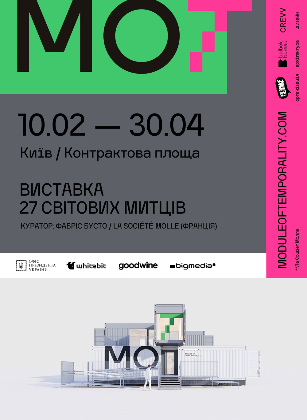
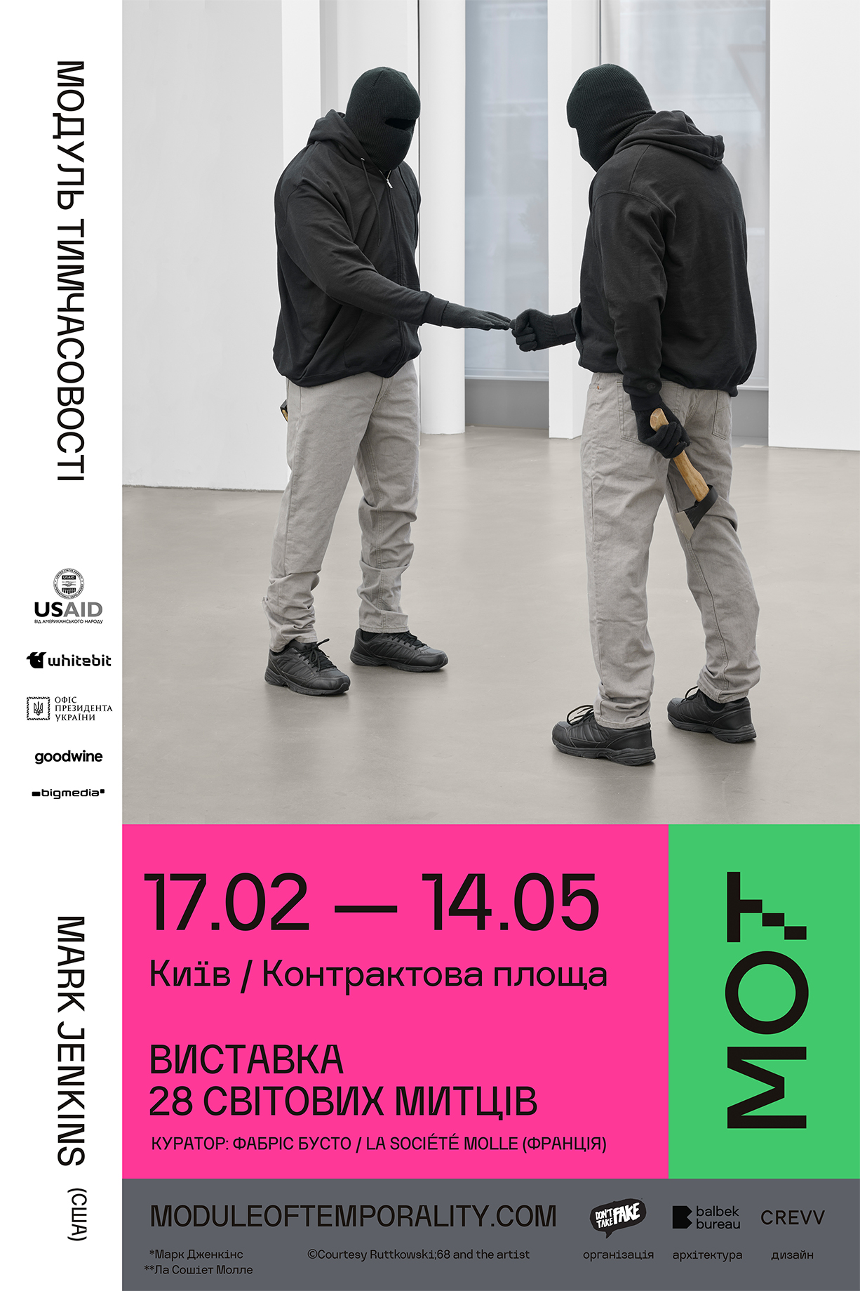
First of all, we wanted to reflect the idea inherent in the name Module of Temporality. The whole project’s identity is a modular system, changing from one medium to another. It is not static, there are no permanent guides, so the relationships of the elements in the layout are always different. This allows us to constantly develop the identity, to look for new solutions in each individual case.
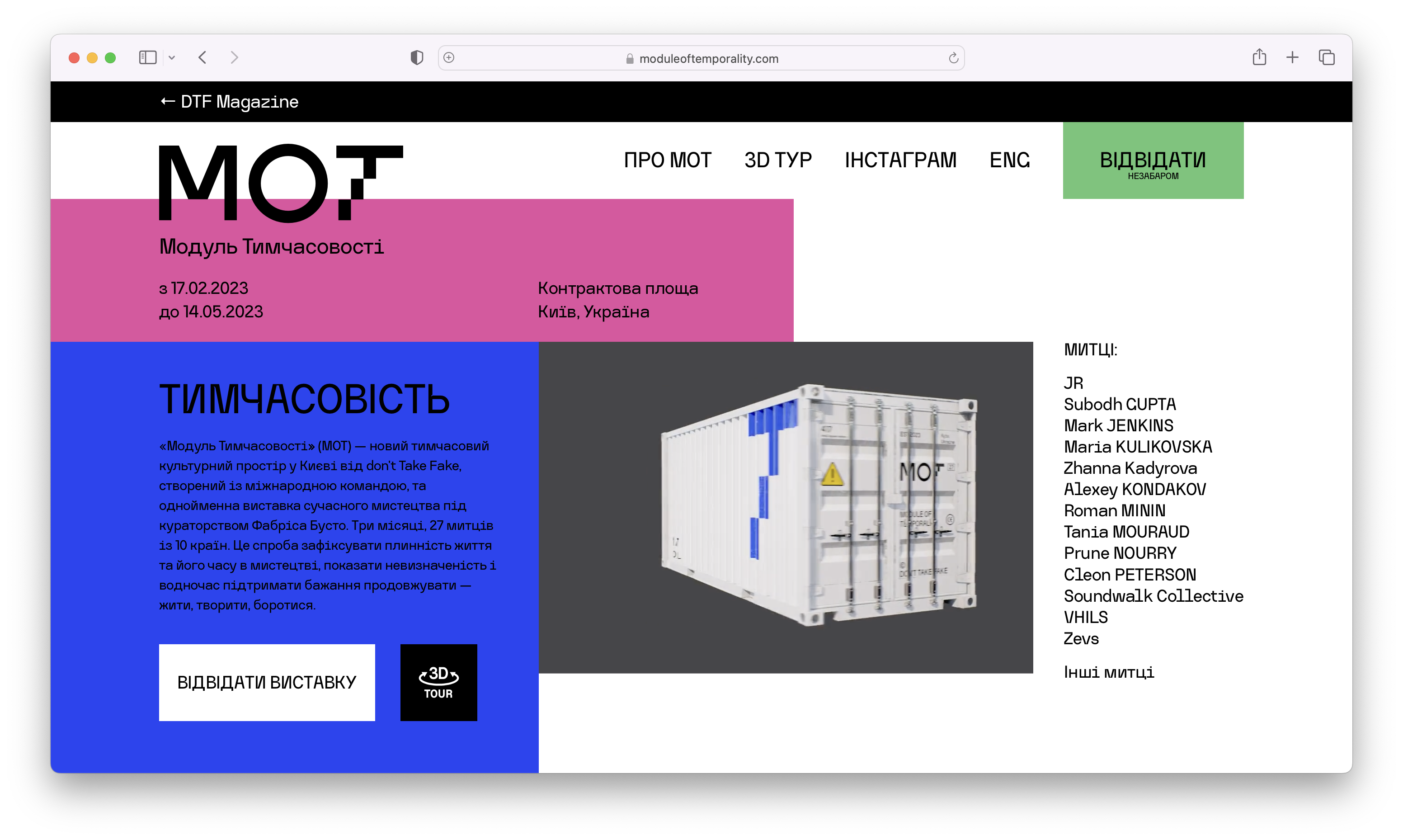
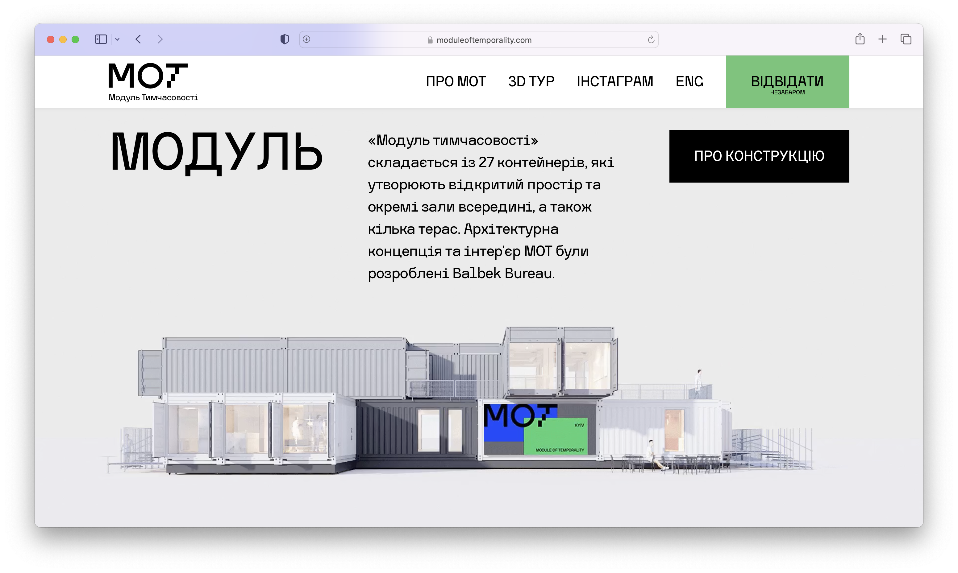
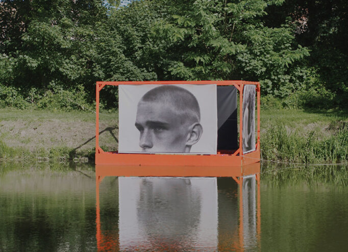
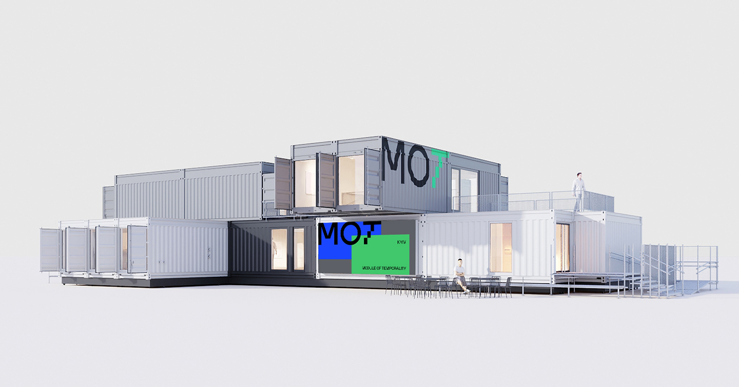
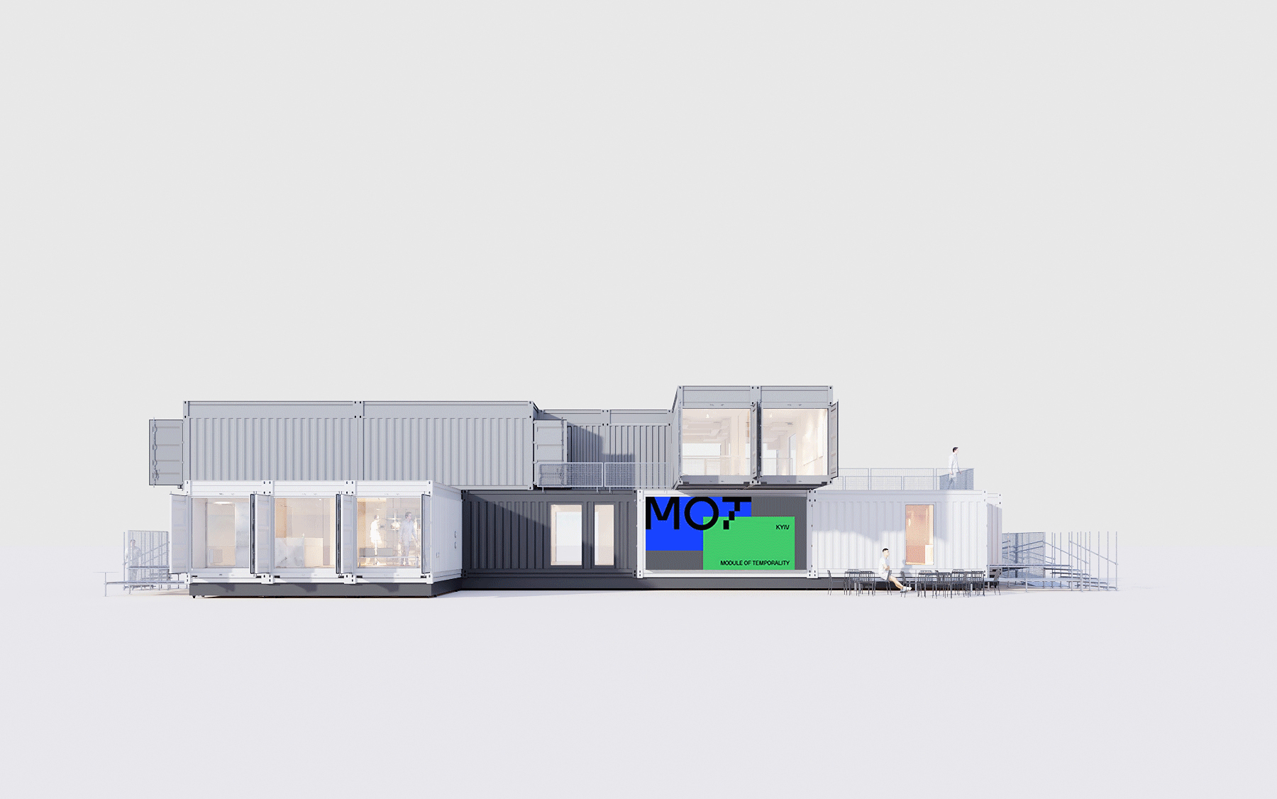
The graphic modules are a reference to the construction of MOT space — it consists of 27 containers-modules. They are all combined in different ways and form an abstract geometric composition. Therefore, the identity works on the same principle as the architecture of the project.
The letter “T” is accentuated in the MOT logo. It stands for “Temporality”, and that is what we wanted to emphasize. The vertical line of the letter is made of three modules. It is a metaphor for the timeline and the concept of time, consisting of past, present, and future.
Colors. In searching for a color solution, we looked at the context of space placement in the modern city environment, as well as at the primary color palette of the containers from which the Module of Temporality space is assembled. Containers usually have more restrained colors, and we wanted to make an atypical color design, to make them more noticeable and non-standard.
Also, given the context of the locations where MOT may be assembled, and the date of the opening of the space, which will be held in winter in Kyiv, I would like to see the identity be a striking addition, particularly in terms of the landscape of the city. But there is a lot of white in the exterior so that the design is not too “fun” and does not contrast with the environment.
Сайт МОТ